Exposure: -0.20
Contrast: +14
Highlights: -70
Shadows: -20
Whites: +43
Blacks: -28
Clarity: +63
In this image, I looked to capture variety in the texture and lines of the wheel. The wheel tread also shows a pattern which gives the image more variety.
Friday, March 27, 2015
Rhythm
In this photo, I tried to capture the rhythm between the blending of the two different colored surfaces. In order to make the picture have more unity in the texture I had to increase clarity settings in the camera raw app.
Exposure: -0.40
Contrast: +55
Highlights: +33
Shadows: -0.65
Whites: +40
Blacks: -28
Clarity: +37
Variety In NY Lens Blog
Documenting the Blues in the Mississippi Delta: Photo 7
This picture shows variety in that:
1. there is variety in the textures, the background is very rough while the skin of the people are very smooth.
2. there is variety in hue, the background consists of a lighter hue while the woman and children are of a darker hue which draws more focus to them
3. there is variety in the lines, where the background consists of faint lines that are not as defined as the lines of the woman and children, because all the focus is on them
Friday, March 20, 2015
Proportion
In this photo trying to show proportion (more a lack of to be exact) I had Jason stand farther behind the fire hydrant instead of right next to it to give the impression that the hydrant was half the size Jason when in reality it was much smaller. Thus greatly making the proportion off.
Exposure: +27
Contrast: +56
Highlights: +45
Shadows: +5
Whites: +34
Blacks: -14
Clarity: +67
Thursday, March 19, 2015
Pattern
This image that I captured demonstrates the Principle of Design: Pattern because it consists of one repeating object (the circles) throughout the entire picture.
Exposure: -0.40
Contrast: +60
Highlights: +33
Shadows: -20
Whites: +10
Blacks: -28
Clarity: +8
Exposure: -0.40
Contrast: +60
Highlights: +33
Shadows: -20
Whites: +10
Blacks: -28
Clarity: +8
Wednesday, March 18, 2015
Repetition
The definition of Repetition is the repeating of an object in collaboration with a pattern to make the image seem active and to add unity. In this case I captured the image of a mural of a piano which had the white keys as a pattern, and the black keys as showing repetition.
Exposure: -0.45
Contrast: +76
Highlights: +84
Shadows: -49
Whites: +34
Blacks: -58
Clarity: +73
Exposure: -0.45
Contrast: +76
Highlights: +84
Shadows: -49
Whites: +34
Blacks: -58
Clarity: +73
Wednesday, March 11, 2015
Structure and Emphasis
In this photo, I captured a close up of "The Thinker" statue (the structure) and I wanted to put an emphasis on the texture of the statue (the defined and rough metal).
Exposure: +0.50
Contrast: +25
Highlights: +38
Shadows: +19
Whites: +0.89
Blacks: -0.57
Clarity: 49
Exposure: +0.50
Contrast: +25
Highlights: +38
Shadows: +19
Whites: +0.89
Blacks: -0.57
Clarity: 49
Tuesday, March 10, 2015
Structure and Balance
This image that I captured shows near perfect balance in a structure because of the mirroring of the doors and panels.
Exposure: -10
Contrast: +56
Highlights: -0.6
Shadows: +47
Whites: +0.65
Blacks: +50
Clarity: +36
Exposure: -10
Contrast: +56
Highlights: -0.6
Shadows: +47
Whites: +0.65
Blacks: +50
Clarity: +36
Friday, March 6, 2015
Texture
In this photo I wanted to capture the texture of the plant by focusing on the small hair follicles on the leaves and the abrasions in the leaves.
Exposure: 0
Contrast: +32
Highlights: +35
Shadows: +14
Whites: 0
Blacks: +16
Clarity: +49
Exposure: 0
Contrast: +32
Highlights: +35
Shadows: +14
Whites: 0
Blacks: +16
Clarity: +49
Thursday, March 5, 2015
Space
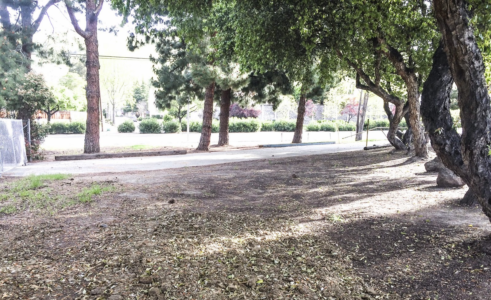
This is image I captured shows space next to the MSJ garden by Mission Blvd. I liked how the trees gave a sense of enclosing this area making the space even more apparent and obvious, and I also managed to capture a shot that had no cars in the background.
Exposure: +16
Contrast: +40
Highlights: +33
Shadows: -0.45
Whites: +48
Blacks: -64
Clarity: +27
Red
Exposure: -6
Contrast: +4
Highlights: 0
Shadows: +12
Whites: +0.43
Blacks: 0
Clarity:
Tuesday, March 3, 2015
Form
This image shows form by capturing the three dimensional shape of the tanbark. An argument could be made on the actual shape of the tanbark such as it being a rectangular prism with a section chipped off.
Exposure: +25
Contrast: +2
Highlights: +16
Shadows: +13
Whites: +28
Blacks: +0.54
Clarity:+38
Exposure: +25
Contrast: +2
Highlights: +16
Shadows: +13
Whites: +28
Blacks: +0.54
Clarity:
Subscribe to:
Comments (Atom)


