Tuesday, June 9, 2015

Final Exam

4. The photo that  I have taken that has changed how I view photography would be my "First Commercial Shoot" photo of Divine. To capture this image, I was introduced to a whole separate aspect of photography. Lighting. I never would have thought that such small changes in lighting would be able to make such a drastic effect on an image. To take this picture, it required a whole different process of preparation. As a group we had to set up light boxes and the background to just the way we wanted those aspects to appear in the image which was a very different route of photography for me because all this time I was just clicking at whatever I saw was interesting and leaving the photo as it was. The process to get this image was enlightening and has changed the way I view photography.
5. There are a good number of differences between shape and form. Firstly, shapes are defined by closed lines, and consist of geometric shapes such as triangles, circles, or squares. Thus making shape two dimensional and expressing length and width. On the contrary, Forms are three dimensional and representative of figures such as cubes, cylinders and spheres. Form would be an expression of length, width, and depth. 


6. The difference between pattern and repetition is that patterns are a repeating image across the whole picture when the images are identical, whilst repetition is an augmentation of a pattern to make the picture seem full of action. This would then create a sense of unity in the picture. 


7. Movement is the sequence of objects in an image in which your eyes will attract to whilst viewing the image. Unconsciously, movement usually causes the eyes to attract towards objects such as lines, edges, colors, and shapes in an image. 

Attached is a link to my picture highlighting the Principle of Design of Movement

8. Of the last three projects, my best work would be the First Photo in my Presentation Project. In my opinion, this is my best work because of the way it changed me and made me see things differently. This piece of work changed me in that it made me appreciate life more. Taking this picture, I realized that life goes by very quickly. I learned to see differently in that appreciating life's happy moments is key to living to the fullest, because it won't always be that way. My dog Juno was ecstatic when we first got her, and looking at the happiness and youth in first picture which I attached, to how she she has grown and matured now, has made me see that through images we are able to see the best in life. 

Tuesday, May 26, 2015

Presentation Project - Man's Best Friend


http://ryenteo1.weebly.com/


http://jessefreidin.com/
http://www.sharonmontrose.com/
http://markrogersphotography.com/pets

Monday, April 13, 2015

Movement

I did not make any edits to the image in Camera Raw.

Personally, for movement in the picture, my eyes first attracted to the giant poster sign on the wall showing a pineapple. Then, my eyes moved to the to the "Terminal Sales Bldg." sign. Next my eyes traveled to the cars and people below the sign (and the most eye attracting object was the yellow taxi). Finally, my eyes went to the red crane in the top left corner of the image.

Unity

Exposure: +0.55
Contrast: +40
Highlights: +82
Shadows: -40
Whites: +88
Blacks: -3
Clarity: +23

This image that I captured shows unity through the fact that the symmetry of the building adds the rule of unity to the picture by completeness of the object.

Wednesday, April 1, 2015

Shutter Speed and Everything After

Partner: Marissa Padilla
1. Considering the fact that all objects in the photo appear sharp and in focus, I would think the shutter speed was fast.
2. Rule of Composition: Balancing Elements (Ryen), Depth of Field (Marissa)
3. Element of Art: Lines: There are many lines in this picture and can be seen in the road markings, the road barrier, the horizon, and the edges of the trucks.
4. Principle of Design: Movement: For movement in the photo, the first thing my eyes attract to is the bright color of the red and blue truck, then to the truck that has been blown over because it is a very odd scene, and finally the bright green truck in the background, also because of its vibrant color. 


1/1500s
ISO 32
4.2mm

Exposure: +47
Contrast: +38
Highlights: +-0.75
Shadows: +28
Whites: +40
Blacks: -28
Clarity: +49


Friday, March 27, 2015

Variety

Exposure: -0.20
Contrast: +14
Highlights: -70
Shadows: -20
Whites: +43
Blacks: -28
Clarity: +63

In this image, I looked to capture variety in the texture and lines of the wheel. The wheel tread also shows a pattern which gives the image more variety.

Rhythm


In this photo, I tried to capture the rhythm between the blending of the two different colored surfaces. In order to make the picture have more unity in the texture I had to increase clarity settings in the camera raw app.

Exposure: -0.40
Contrast: +55
Highlights: +33
Shadows: -0.65
Whites: +40
Blacks: -28
Clarity: +37

Variety In NY Lens Blog

Documenting the Blues in the Mississippi Delta: Photo 7

This picture shows variety in that:

1. there is variety in the textures, the background is very rough while the skin of the people are very smooth.
2. there is variety in hue, the background consists of a lighter hue while the woman and children are of a darker hue which draws more focus to them
3. there is variety in the lines, where the background consists of faint lines that are not as defined as the lines of the woman and children, because all the focus is on them

Friday, March 20, 2015

Proportion


In this photo trying to show proportion (more a lack of to be exact) I had Jason stand farther behind the fire hydrant instead of right next to it to give the impression that the hydrant was half the size Jason when in reality it was much smaller. Thus greatly making the proportion off.

Exposure: +27
Contrast: +56
Highlights: +45
Shadows: +5
Whites: +34
Blacks: -14
Clarity: +67

Thursday, March 19, 2015

Pattern

This image that I captured demonstrates the Principle of Design: Pattern because it consists of one repeating object (the circles) throughout the entire picture.

Exposure: -0.40
Contrast: +60
Highlights: +33
Shadows: -20
Whites: +10
Blacks: -28
Clarity: +8


Wednesday, March 18, 2015

Repetition

The definition of Repetition is the repeating of an object in collaboration with a pattern to make the image seem active and to add unity. In this case I captured the image of a mural of a piano which had the white keys as a pattern, and the black keys as showing repetition.

Exposure: -0.45
Contrast: +76
Highlights: +84
Shadows: -49
Whites: +34
Blacks: -58
Clarity: +73


Wednesday, March 11, 2015

Structure and Emphasis

In this photo, I captured a close up of "The Thinker" statue (the structure) and I wanted to put an emphasis on the texture of the statue (the defined and rough metal).

Exposure: +0.50
Contrast: +25
Highlights: +38
Shadows: +19
Whites: +0.89
Blacks: -0.57
Clarity: 49

Tuesday, March 10, 2015

Structure and Balance

This image that I captured shows near perfect balance in a structure because of  the mirroring of the doors and panels.

Exposure: -10
Contrast: +56
Highlights: -0.6
Shadows: +47
Whites: +0.65
Blacks: +50
Clarity: +36

Friday, March 6, 2015

Texture

In this photo I wanted to capture the texture of the plant by focusing on the small hair follicles on the leaves and the abrasions in the leaves.

Exposure: 0
Contrast: +32
Highlights: +35
Shadows: +14
Whites: 0
Blacks: +16
Clarity: +49

Thursday, March 5, 2015

Space


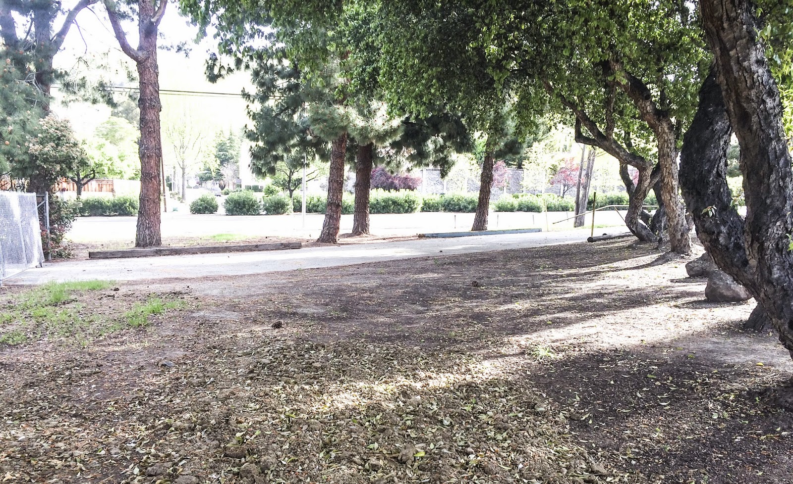
This is image I captured shows space next to the MSJ garden by Mission Blvd. I liked how the trees gave a sense of enclosing this area making the space even more apparent and obvious, and I also managed to capture a shot that had no cars in the background.

Exposure: +16
Contrast: +40
Highlights: +33
Shadows: -0.45
Whites: +48
Blacks: -64
Clarity: +27

Red


After Spinning a Red, Left Foot on the Twister Spinner, I decided to use this red rose in the bottom left of the image to satisfy the parameters of the image requirements.

Exposure: -6
Contrast: +4
Highlights: 0
Shadows: +12
Whites: +0.43
Blacks: 0
Clarity: +27

Tuesday, March 3, 2015

Form

This image shows form by capturing the three dimensional shape of the tanbark. An argument could be made on the actual shape of the tanbark such as it being a rectangular prism with a section chipped off.

Exposure: +25
Contrast: +2
Highlights: +16
Shadows: +13
Whites: +28
Blacks: +0.54
Clarity: +38

Friday, February 27, 2015

Shapes


In this photo, I captured the circular shape of the conic sections that were holding plants. From a different angle, the objects in the image may appear as cylinders, but from the angle I captured the image, it is circles that appear.

Exposure: -0.45
Contrast: +21
Highlights: -10
Shadows: +17
Whites: -0.69
Blacks: +11
Clarity: +29

Lines

I captured the Principle of Design of Lines in Nature in this photo by getting the detail in the bark going up the trunk of the tree and the lines in the outspreading branches.


Exposure: +14
Contrast: +8
Highlights: +11
Shadows: +18
Whites: -0.56
Blacks: +0.24
Clarity: +46


Wednesday, February 4, 2015